About the
Client
Bourgon Contracting is a full-service renovation company specializing in house-flipping and general contracting. To help launch their endeavour into home renovations, Bourgon Contracting hired me to create a visual brand that would fit the company's personality while demonstrating their energy and professionalism.
My
Approach
Given that Bourgon Contracting was a new business with no previous branding, I had a clean slate to work from. I decided to focus on the client's personality, and what his key differentiating factors were from other general contracting companies in the city. This lead to me to experience with bold colours, strong shapes, angled lines, and most importantly the incorporation of letters "B" and "C".
Initial sketch
First itiration
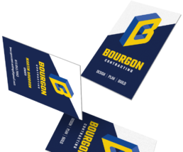
Final design
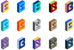
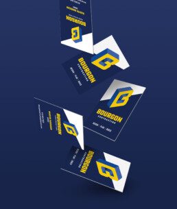
Creating various colours and patterns for the logo was an important aspect to demonstrate, since it helped showcase the approachability of the brand.
Creating the foundations of a
Visual language
A vibrant, tri-coloured logo needed strong branding guidelines to help navigate the various different applications it was going to be used for. I produced a detailed document outlining the specific colours of the brand alongside does and don'ts to help guide the client use the logo on different applications the best way possible.
Colours
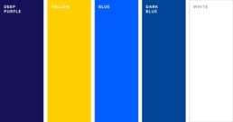
With such a vibrant colour palette, it was important to give detailed guidelines to help keep the brand defined.
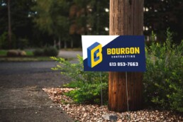
The
Results
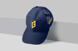
Bourgon Contracting received a new brand that promoted his personality and stood out in the very competitive market of residential home contracting. Within the first weeks of the final concept, the client had already began applying his logo to hats, sweatshirts and decals - making an immediate impact in the company's early beginnings.